Compare Feature & Overlay Analysis
Relative strength, correlation analysis, and pairs trading using the Compare tool.
The 'Compare' feature in TradingView is arguably the most powerful yet underutilized tool on the platform. It enables you to overlay multiple assets on a single chart—revealing macroeconomic correlations, relative strength, and sector rotation patterns that are completely invisible when viewing instruments in isolation.
Institutional fund managers do not look at single stocks in a vacuum; they analyze how capital flows between sectors, asset classes, and geographies. By mastering the Compare tool and custom Spread Charts, you can replicate this institutional workflow directly within your charting interface.
1. The Power of the Compare Tool
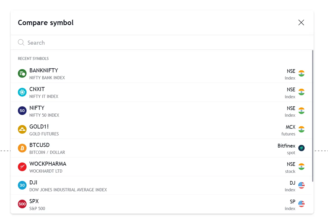
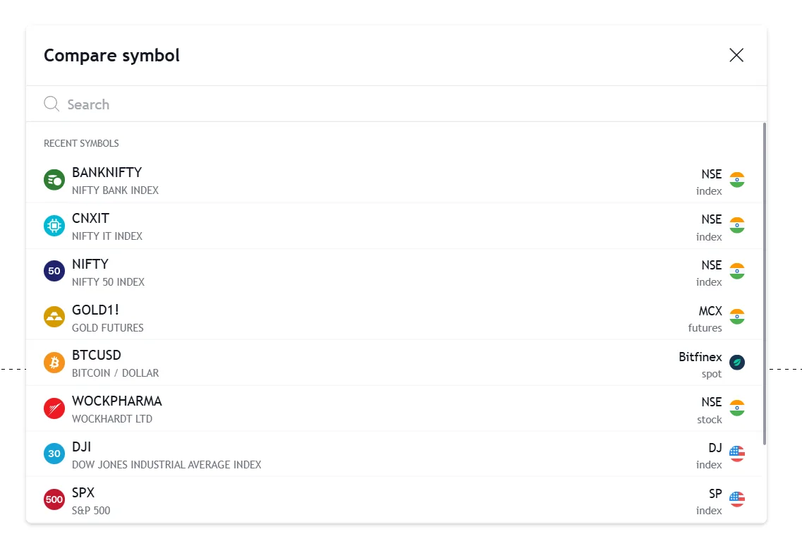
With access to over 3,539,722 instruments, the Compare feature (accessed via the '+' icon on the top toolbar) lets you instantly overlay any two or more assets onto your primary canvas.
This tool transforms your view from absolute performance to relative performance. For example, knowing that an IT stock went up 5% is good, but knowing it went up 5% while the broader IT index went down 2% is actionable intelligence. That represents severe relative strength.
When you add a symbol via the Compare menu, TradingView plots it as a clean Line chart by default, ensuring your primary candlestick chart remains readable without visual clutter.
| Features | TradingView | Traditional Brokers |
|---|---|---|
| Price Scaling | Independent scales per asset | Forced single scale |
| Percentage View | Automatic normalization | Manual calculation required |
| Asset Classes | Mix Crypto, Stocks, FX | Often siloed by exchange |
Key takeaways
- Spot pricing divergences instantly (e.g., Nifty hits a new high, but Bank Nifty fails to confirm).
- Track relative momentum to identify which market sectors are currently absorbing institutional capital.
- Overlay global benchmarks (S&P 500, Nasdaq) against Indian indices to gauge global correlation.
Official resources
2. Overlay vs. New Pane (Scale Mastery)
The biggest mistake traders make when comparing symbols is ignoring the scale. If you try to overlay a ₹80,000 MRF stock on a ₹25,000 Nifty chart using a standard price scale, the chart will flatten out and become unreadable.
TradingView provides three distinct scaling methods when you add a comparison symbol. Understanding these is critical to keeping your charts functional.
Same % Scale (Relative Performance)
- The absolute best option for comparing performance.
- Anchors both assets at 0% on the left side of the screen.
- Shows which asset grew or fell by a larger percentage over the visible time range.
New Price Scale (Dual Axis)
- Adds a separate vertical axis (usually on the left).
- Allows both assets to fluctuate visually according to their own price levels.
- Best for comparing highly correlated assets with different nominal prices.
New Pane (Isolated View)
- Pushes the comparison symbol into a completely separate box below the main chart.
- Prevents any overlapping of candlesticks or lines.
- Best when applying separate indicators to the compared symbol.
Critical warning
If your chart suddenly 'flattens out' into a straight line after adding a symbol, it means you have a massive price mismatch on a standard scale. Right-click the scale and check 'Percentage' or move the overlay to a 'New Pane'.
3. Advanced: Ratio Spread Charts (Math Operations)
While the Compare tool overlays two separate lines, TradingView's hidden superpower is the ability to do mathematical operations directly in the Symbol Search bar to create a singular 'Spread Chart'.
By typing a formula like `[Symbol A] / [Symbol B]`, the TradingView servers will divide the price of Asset A by Asset B at every single historical data point, generating a brand new custom line chart.
If you type `NSE:TCS / NSE:CNXIT`, you are creating a pure Relative Strength line. If this line is trending upwards, TCS is mathematically outperforming the broader IT sector, regardless of whether the overall market is in a bull or bear phase. This entirely isolates the stock's intrinsic momentum.
Division (Relative Strength)
- Syntax: `Asset A / Asset B`
- Example: `NSE:RELIANCE / NSE:NIFTY`
- Rising line = Asset A is outperforming.
Subtraction (Yield & Premium)
- Syntax: `Asset A - Asset B`
- Example: `NIFTY F1! - NSE:NIFTY`
- Tracks the premium/discount between Spot and Futures.
Multiplication (Currency Adjustment)
- Syntax: `Asset A * Currency`
- Example: `MCX:GOLD1! * FX_IDC:USDINR`
- Adjusts domestic commodity prices against currency fluctuations.
Professional tip
You can apply technical indicators directly to Spread Charts! Try adding an RSI or a Moving Average to a `TCS / NIFTY` ratio chart to generate systematic entry signals based purely on relative momentum.
4. Institutional Use Cases (Indian Markets)
How do professional fund managers use these tools in the Indian context? They use them to hunt for sector rotation, execute pairs trades, and monitor macroeconomic divergence.
Spotting Sector Rotation
- Compare `NSE:BANKNIFTY` against `NSE:NIFTY`.
- When the ratio breaks out of a downtrend, it signals that institutional money is rotating heavily into Banking stocks to drive the next leg of the bull market.
Statistical Pairs Trading
- Create a spread between highly correlated peers, like `NSE:HDFCBANK / NSE:ICICIBANK`.
- When the ratio hits an extreme historical standard deviation, traders short the outperformer and buy the underperformer, betting on mean reversion.
Macro Correlations
- Overlay `USOIL` (Crude) on an `NSE:INDIGO` (Aviation) chart.
- Because aviation fuel is a massive cost, spikes in Crude often heavily inverse-correlate with airline stock performance. Tracking this overlay provides early warning signals.
The Compare and Spread tools transform your chart from a basic single-asset view into a multi-dimensional, institutional-grade analytical canvas.
Unlock TradingView Pro
More charts per layout, custom timeframes and more indicators per chart.
Common questions
Click the '+' (Compare) button on the top toolbar next to your symbol name, then search for the second symbol. It will overlay on your chart. For the best visual comparison, ensure you right-click the price scale and select 'Percentage', which anchors both stocks at 0% and tracks their relative growth perfectly.
Official TradingView resources
- Help CenterCar Registrations (CAR)Domestic sales of passenger vehicles.All countries for which CAR is available are listed below:ArgentinaAustraliaAustriaAzerbaijanBahrainBelgiumBrazil...
- Help CenterCash Reserve Ratio (CRR)Central bank reserve requirements.All countries for which CRR is available are listed below:AngolaBelarusBrazilChinaCroatiaCzech RepublicHungaryIndiaI...
- Help CenterJobs To Applications Ratio (JAR)The ratio of the number of vacancies to the number of applicants.All countries for which JAR is available are listed below:Japan...
- Help CenterGDP From Public Administration (GDPPA)GDP from public administration.All countries for which GDPPA is available are listed below:AlbaniaAlgeriaAngolaArgentinaArmeniaAustraliaAzerbaijanBahr...
Keep reading
- Module undefinedSymbol Search & TimeframesFinding any asset instantly and mastering multi-timeframe analysis.
- Module undefinedChart Types — Complete GuideFrom candlesticks to Heikin Ashi — choosing the right visualization for every analysis.
- Module undefinedIndicators, Metrics & StrategiesYour complete technical analysis toolkit — from moving averages to Pine Script.
- Module undefinedTop Menu & Account BasicsNavigating the control panel — profile settings, home, help center, and dark mode.

Written By
Rohit Singh
Mr. Chartist
With 14+ years of experience in Indian financial markets, Rohit Singh (Mr. Chartist) is a SEBI Registered Research Analyst, Amazon #1 bestselling author, and the founder of Investology — a premium trading ecosystem trusted by a 1.5 Lakh+ strong community across India.
TradingView is a registered trademark of TradingView, Inc. All screenshots, logos and platform imagery are the property of TradingView, Inc. and are used here for educational purposes only under fair use. This content is not affiliated with, endorsed or sponsored by TradingView. (c) 2026 TradingView, Inc. All rights reserved. www.tradingview.com